Eclectic Townhouse Brentford
Eclectic Townhouse Brentford
Eclectic Townhouse Brentford
Eclectic Townhouse Brentford
Eclectic Townhouse Brentford
Eclectic Townhouse Brentford
Eclectic Townhouse Brentford
Eclectic Townhouse Brentford
Eclectic Townhouse Brentford
Eclectic Townhouse Brentford
Eclectic Townhouse Brentford
Eclectic Townhouse Brentford
Eclectic Townhouse Brentford
Eclectic Townhouse Brentford
Eclectic Townhouse Brentford
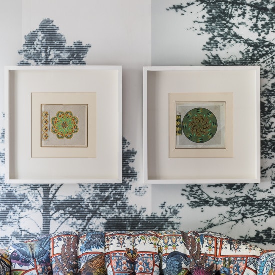
The request for work was to help convert a brand new 4 storey townhouse into a vibrant and eclectic scheme. Our client, Kristjana Williams who is a repeat client for the studio having also designed her Creative Office space wanted her home to reflect her love of art and unusual objects. Our client was also keen to incorporate some of her own works of art, wallpapers & fabrics from her various collections.
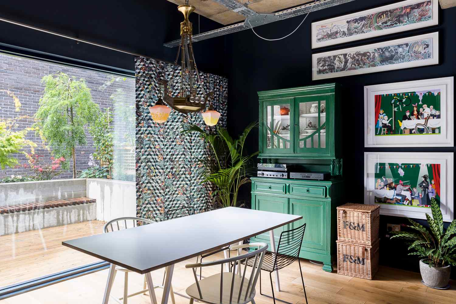
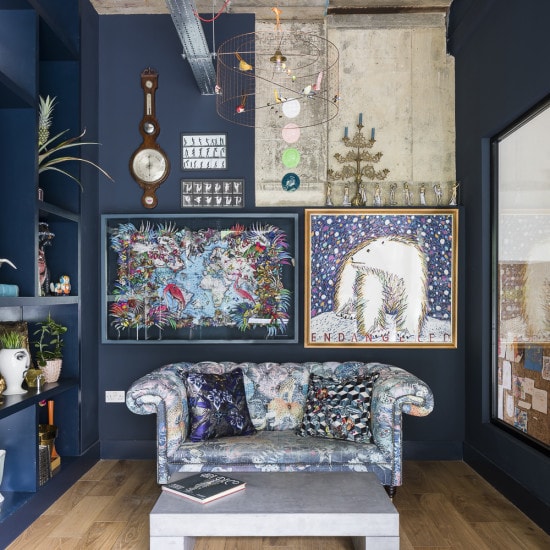
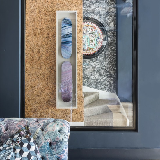
With this brief in mind, we created a backdrop that allowed her art, unusual objects and creative work to come to life. We added more light into the ground floor reception by adding internal windows to provide an additional sense of space. The false ceiling was removed to reveal an additional metre of height and a concrete ceiling. The ceiling was sealed and then coloured fabric electrical cabling installed which we looped through metal grills.
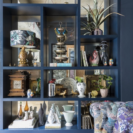
An extra large shelving unit was designed and built to both reflect the space and to allow items to be displayed. The shelves were backed with mirrors that were sand-blasted by a local artisan to create an aged and antique effect. We pulled the scheme together by painting the walls a deep dark blue to help the art stand out.
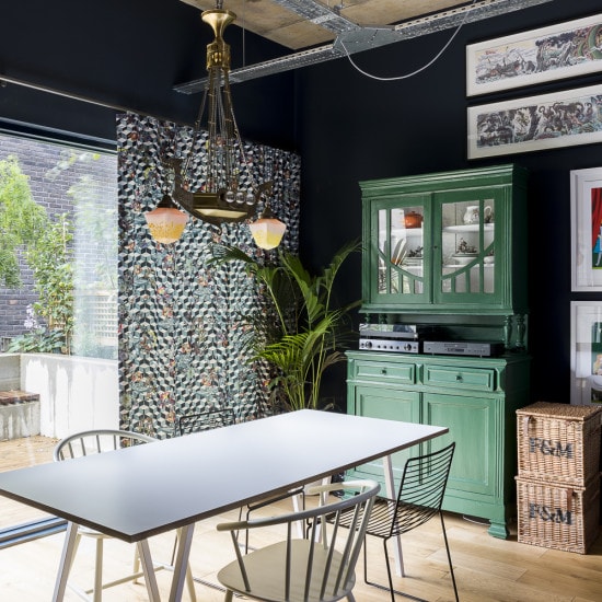
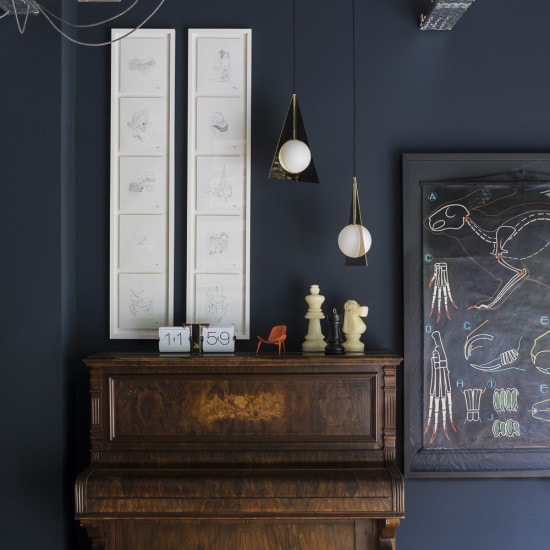
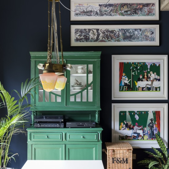
Vintage pieces were then found or refurbished to add extra depth to the scheme. The dresser which was one of the first pieces of furniture my clients purchased as a couple, was repainted in a forest green to off-set the blue walls, the Vintage Dragon Light reflects the clients Viking heritage (being Icelandic) and the piano was found at a bargain at the local charity store. We then brought in modern touches, to work alongside the vintage items and to bring freshness into the space through the Tom Dixon Plane Triangle lights and the design classic Birdcage Lighting.
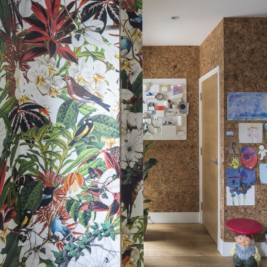
Upon entering the property, we installed a marbled cork wall that runs all the way down the hallway to meet the reception. This provided 2 functions, one to serve as an alternative method to display the kids art and two to add a sense of warmth to what would have been an otherwise long white wall.
The carpet on the upper levels of the home was replaced with a more earthy sisal herringbone carpet. This provided our clients with the option to use rugs on top of the existing sisal carpet if they wanted.
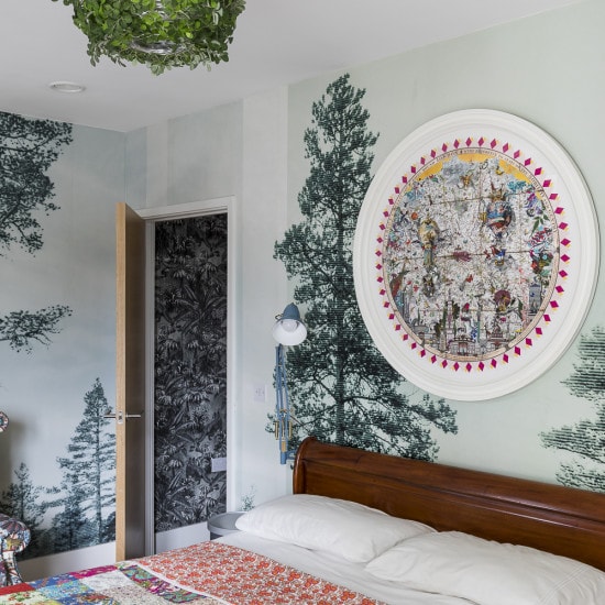
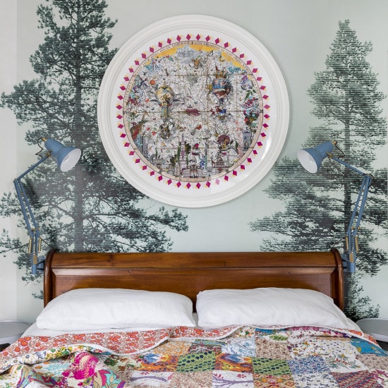
The master bedroom was designed based on the wallpaper that our client loved, so we worked the blue/green colour scheme of the trees wallpaper and then colour matched the blue/green velvet curtains and the Anglepoise bedside lights to work with the rest.
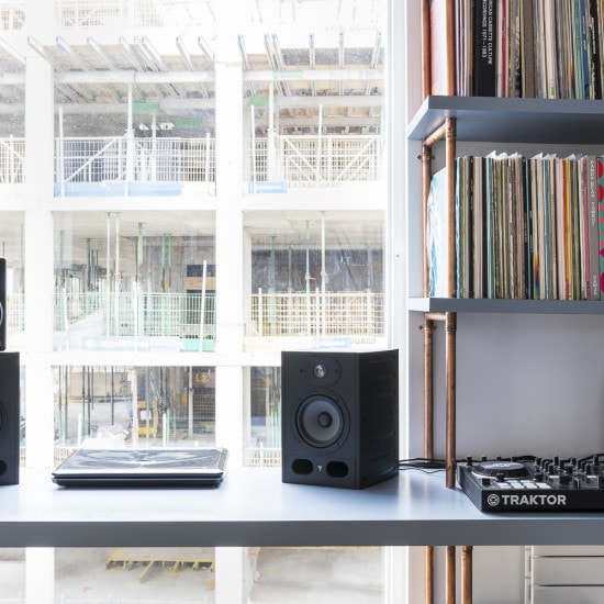
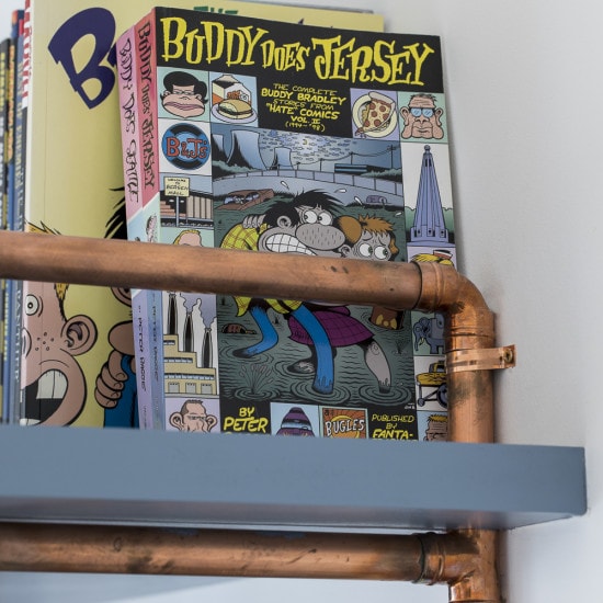
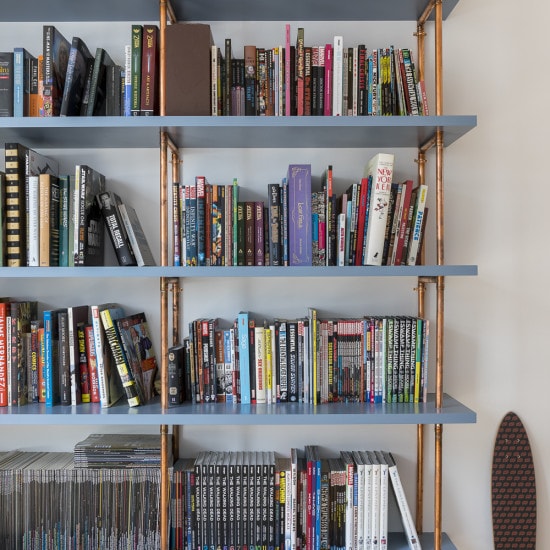
The studio was a space that needed to be both functional and aesthetically pleasing. In order to meet the clients exacting requirements to be able to store his vast record and book collection, we designed the shelving using copper piping and extra thick MDF. The result was a bespoke built in desk and shelving unit that spanned across 2 walls of the room.
Photography by Chris Snook – http://www.chrissnookphotography.co.uk/
