CONTEMPORARY SIDE EXTENSION CHISWICK
CONTEMPORARY SIDE EXTENSION CHISWICK
CONTEMPORARY SIDE EXTENSION CHISWICK
CONTEMPORARY SIDE EXTENSION CHISWICK
CONTEMPORARY SIDE EXTENSION CHISWICK
CONTEMPORARY SIDE EXTENSION CHISWICK
CONTEMPORARY SIDE EXTENSION CHISWICK
CONTEMPORARY SIDE EXTENSION CHISWICK
CONTEMPORARY SIDE EXTENSION CHISWICK
CONTEMPORARY SIDE EXTENSION CHISWICK
CONTEMPORARY SIDE EXTENSION CHISWICK
The request for work was to re-design the layout of the ground floor for our clients who were undertaking a side extension to create more space within the Victorian Terrace.
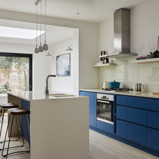
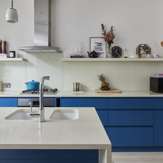
The design brief was to create a space that was open and inviting and allowed for anyone that was in the kitchen to be able to be part of the conversation anywhere within the ground floor. The overall design aesthetic was to use pops of colour while keeping the overall feel light and scandic for the family of 5. White was a favourite for our clients who had a minimalist style.
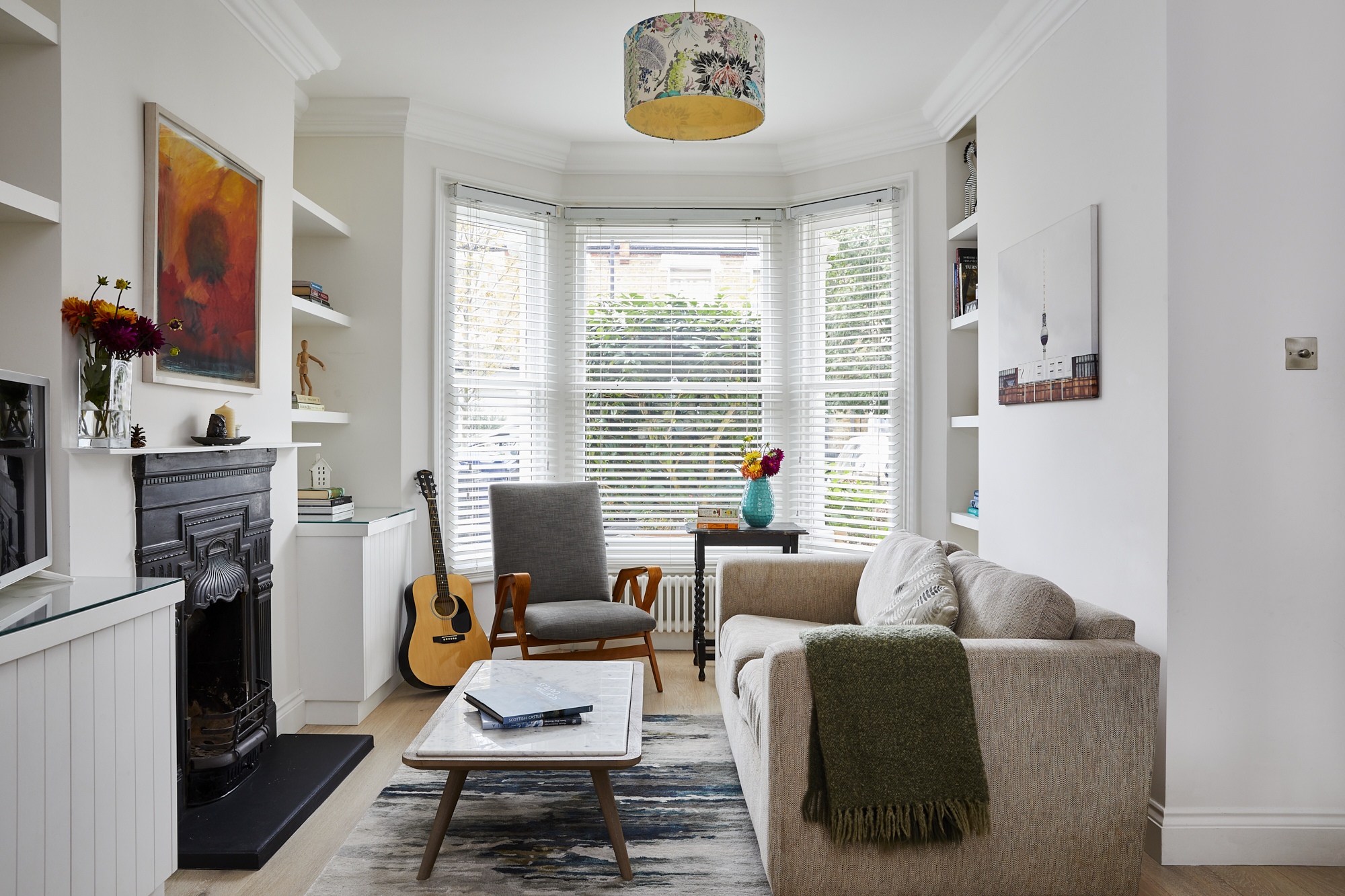
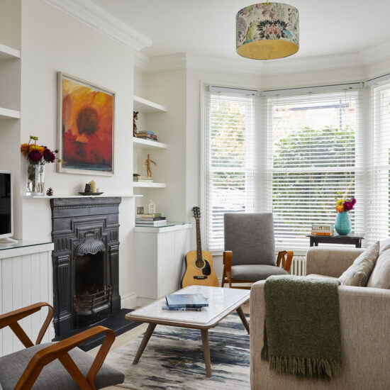
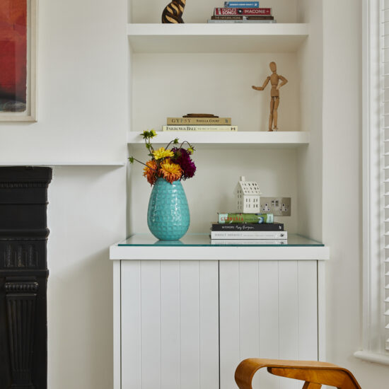
The reception at the front of the property was kept light and bright. We added some subtle details to the joinery to incorporte some subtle detailing while still keeping the overall scheme simple. The mid-century armchairs kept the space modernist and contemporary.
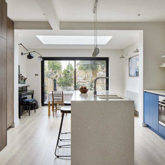
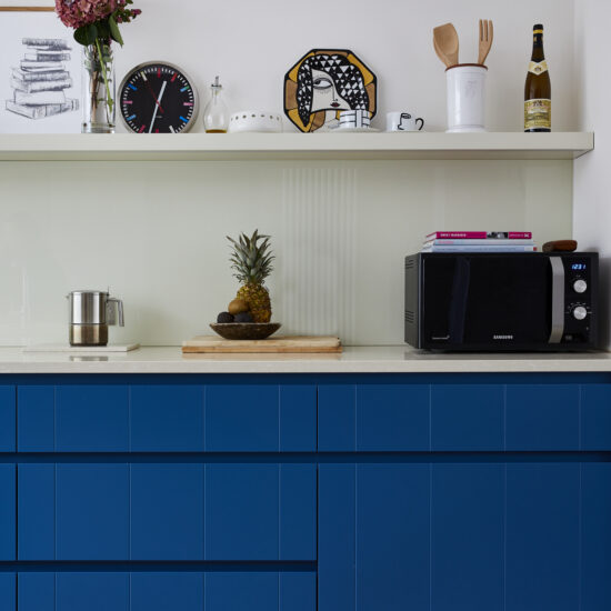
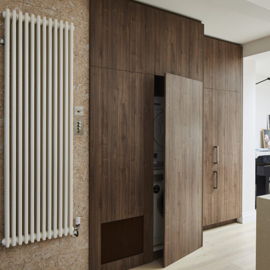
The kitchen was bespoke and was made by our clients father who had a workshop in Switzerland. It was important that the drawings were as accurate as possible to ensure that the kitchen was made to specification and would fit within the space. Our technical drawings were able to fulfil this need and when the kitchen arrived via lorry, it was fitted with ease. The kitchen was designed to meet our clients love of entertaining and it was important to also have space for the washing machine & dryer, so we created a zone on one side of the kitchen that was dedicated for this function. To not make the kitchen feel overwhelming within the space, we designed the utility space with dark walnut veneer doors that were floor to ceiling to make it feel like it was integrated into the wall. Part of the doors also covered the staircase on the other side and allowed for the understairs space to be used for additional storage. To keep the minimalist style, we used handless doors with the exception of the fridge/freezer which required handles.
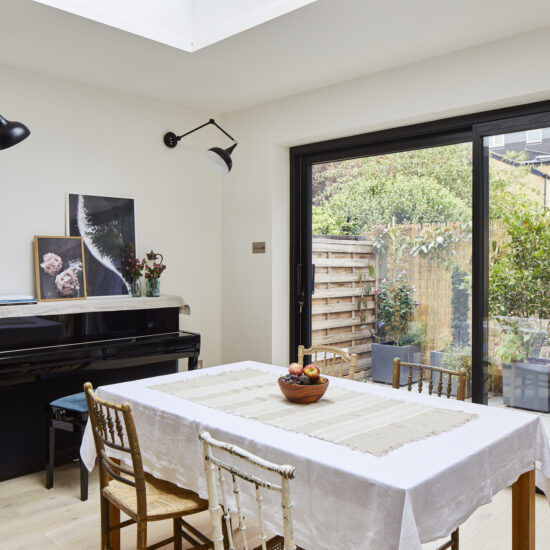
The rear of the space was dedicated to the dining area. It was important to our clients that as much light as possible was allowed into the space and so they installed an extra large skylight to allow a lot of natural light into the space. We highlighted the skylight by adding an LED strip detail around the light to light up the box at night which prevented the space from feeling like a black box when dark. The floor to ceiling glass sliding doors were contemporary in style and worked within the space to allow as much natural light as possible.
Photography by Chris Snook – http://www.chrissnookphotography.co.uk/
