Contemporary Country Bedford Park
Contemporary Country Bedford Park
Contemporary Country Bedford Park
Contemporary Country Bedford Park
Contemporary Country Bedford Park
Contemporary Country Bedford Park
Contemporary Country Bedford Park
Contemporary Country Bedford Park
Contemporary Country Bedford Park
Contemporary Country Bedford Park
Contemporary Country Bedford Park
Contemporary Country Bedford Park
Contemporary Country Bedford Park
Contemporary Country Bedford Park
Contemporary Country Bedford Park
Contemporary Country Bedford Park
Contemporary Country Bedford Park
Contemporary Country Bedford Park
Contemporary Country Bedford Park
Contemporary Country Bedford Park
Contemporary Country Bedford Park
Contemporary Country Bedford Park
Contemporary Country Bedford Park
Contemporary Country Bedford Park
Contemporary Country Bedford Park
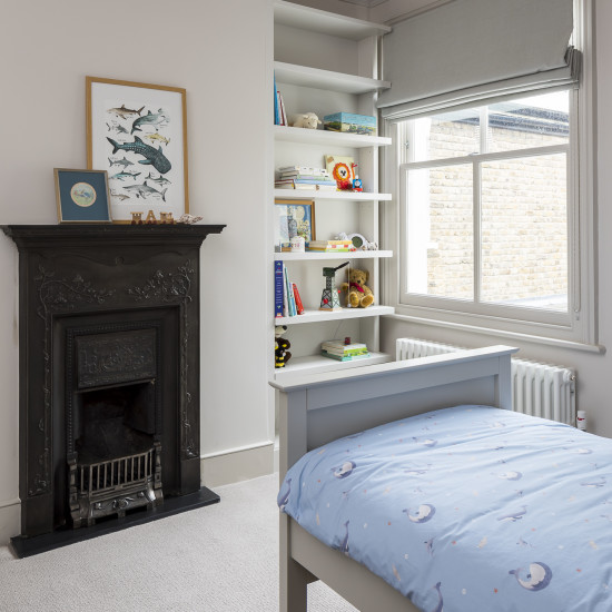
Contemporary Country Bedford Park
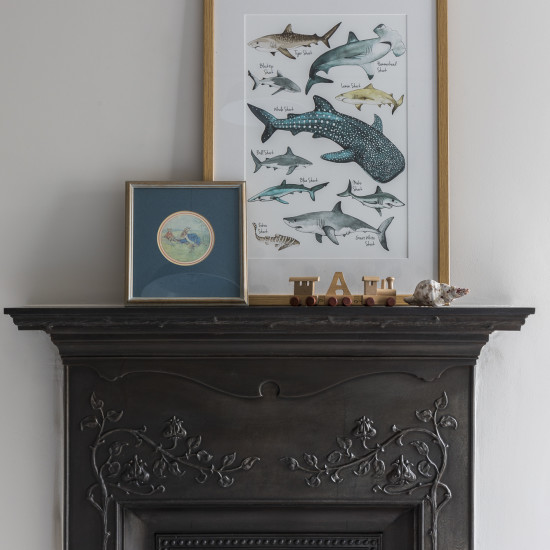
Contemporary Country Bedford Park
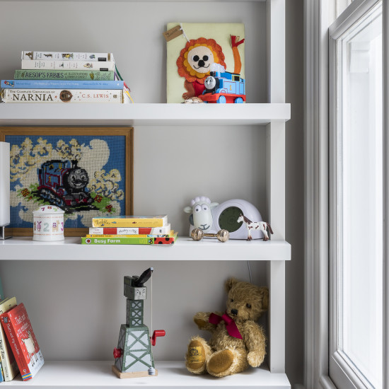
Contemporary Country Bedford Park
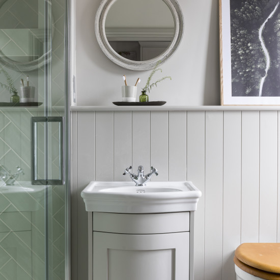
Contemporary Country Bedford Park
Contemporary Country Bedford Park
Contemporary Country Bedford Park
Contemporary Country Bedford Park
Contemporary Country Bedford Park
The request for work was to design and implement the interior of a 3 storey semi-detached family home in London. The house undertook a top to toe refurbishment. The home had previously been renovated by a property development company and the space was an all white shell with low quality fixtures. Our clients engaged us to help them turn the property into a warm and comfortable home for their young growing family.
The entire house was gutted including the kitchen, all bathrooms & utility. Every room had the floor removed and replaced with the exception of the hallway that had original victorian tiling which was kept in place.
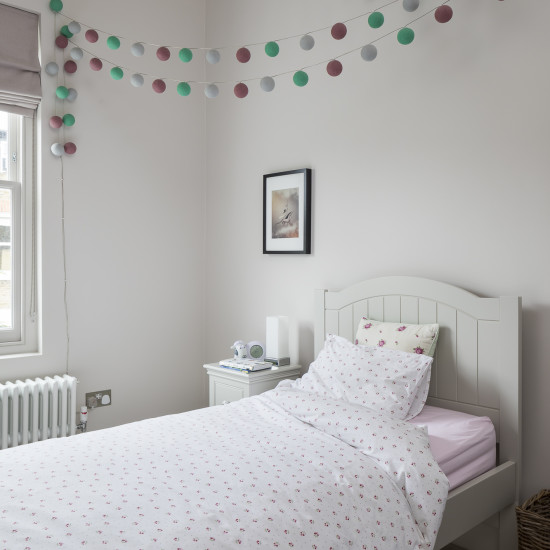
The design brief was to create a warm space for the family to spend time in while keeping in mind our clients traditional tastes. The style we defined was of a contemporary country style that included traditional features.
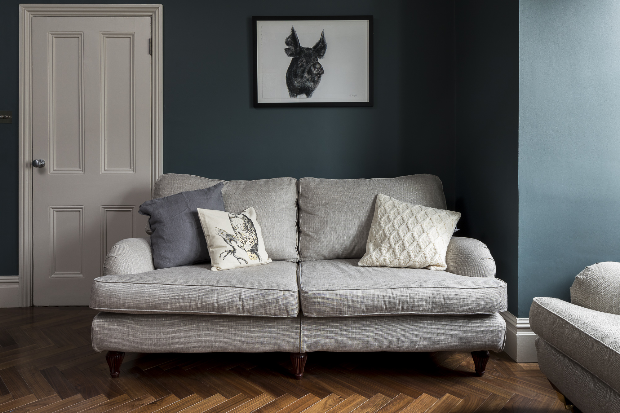
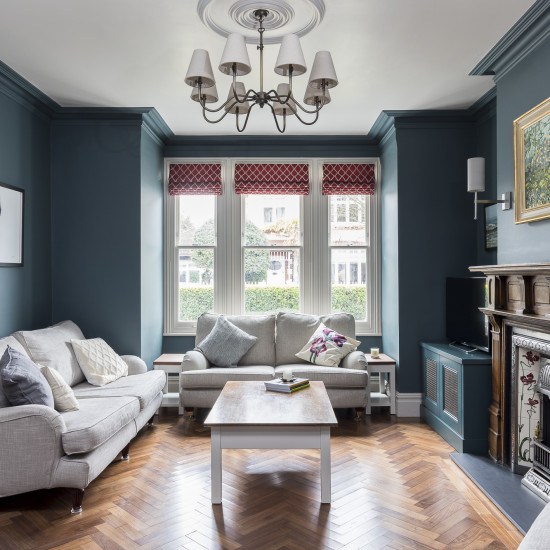
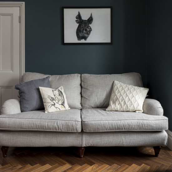
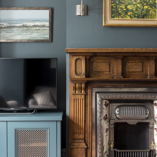
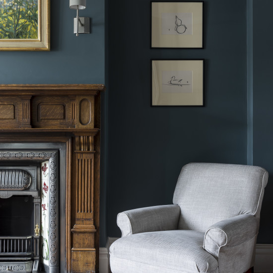
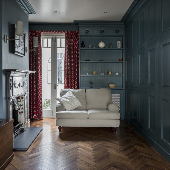
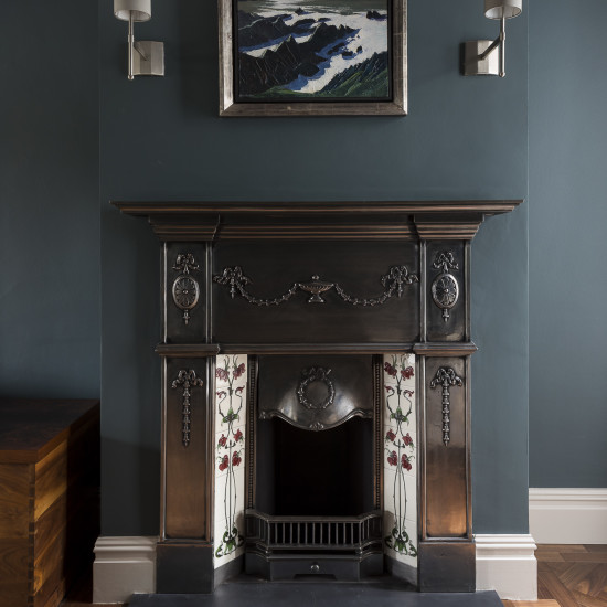
The home had been stripped back to a modern white box by the previous developers so we started by putting back in place some traditional features such as the coving in all the main rooms such as the reception & bedrooms. In the reception room, we kept their existing furniture and had them re-upholstered in a natural colour palette that incorporated different textures and patterns with a subtle undertone. Our clients loved the 2 paintings that were hanging above the chimney breasts and wanted to keep them there, so to add impact and to help light the paintings, we added decorative wall lights on either side of the paintings to add ambience. The floor was replaced with a warm walnut wood installed in a herringbone pattern to create a wow factor when you entered the room, then the walls were painted out in dark green blue colour to add atmosphere against the existing artwork. To show off the coving and height of the ceilings, we also painted the dark colour to include the coving for dramatic affect. The existing fireplace mantles were then enhanced by using aged brass finishes to add warmth and glamour to the room.
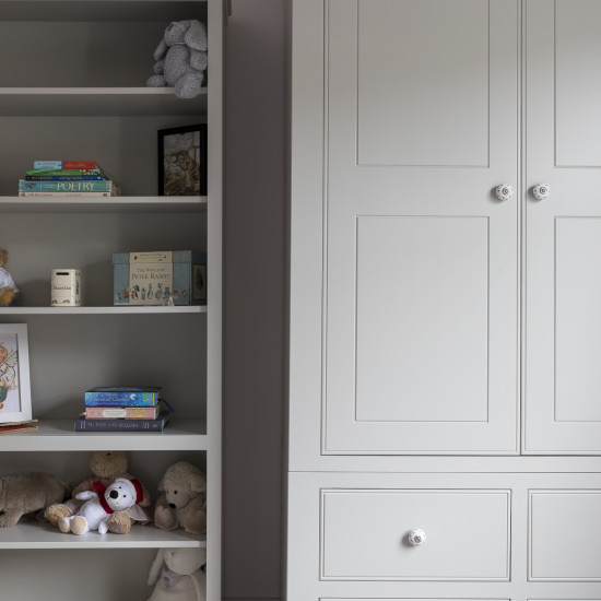
Our clients requested that storage be included into the double reception. So we designed the panelled doors that were handless so that when the doors were closed, it looked like a panelled wall rather than storage.
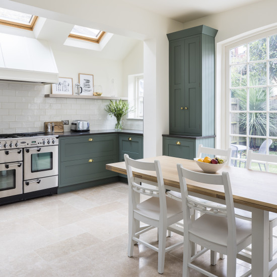
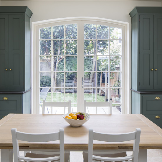
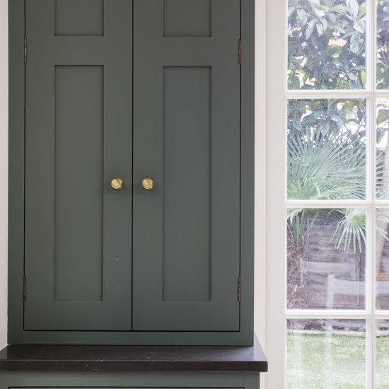
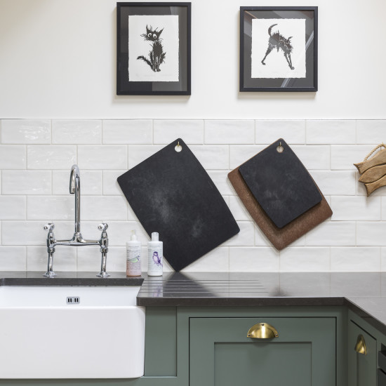
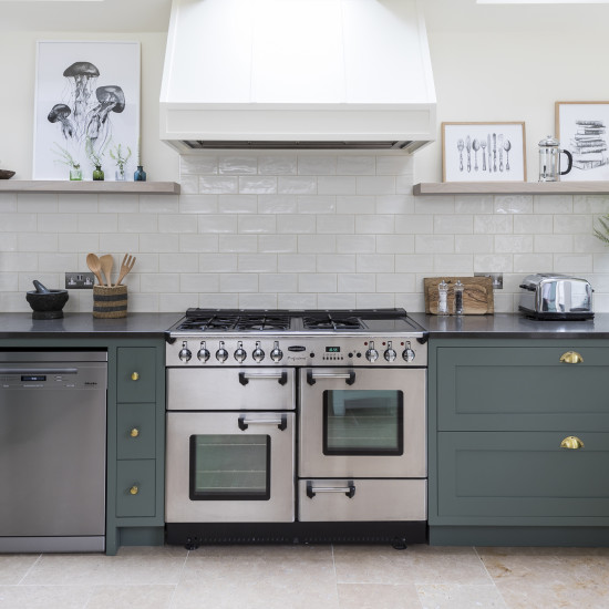
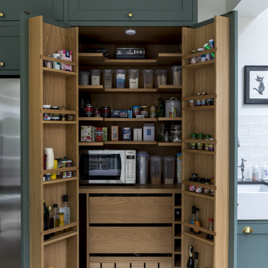
The kitchen was designed to our clients specific requirements, we were requested to try and incorporate a larder if possible so we extended a partition wall within the room to add extra depth to one side and allow for the larder to reside in, this ensured that the extra depth of the larder did not feel imposing. In regards to the cabinets, we opted for a shaker style and then added a contemporary twist by using a dark contemporary colour then paired with aged brass handles . The french doors were replaced with bespoke doors that incorporated a curve to add drama to the scheme. The floor was replaced with a natural limestone.
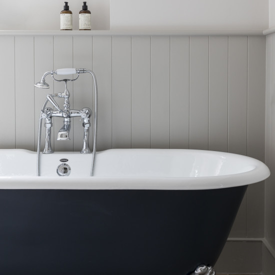
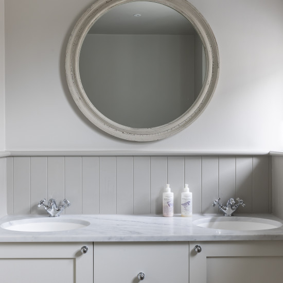
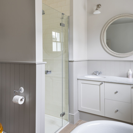
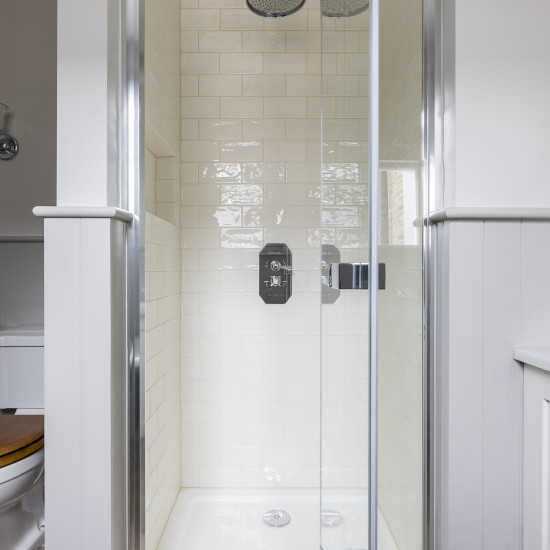
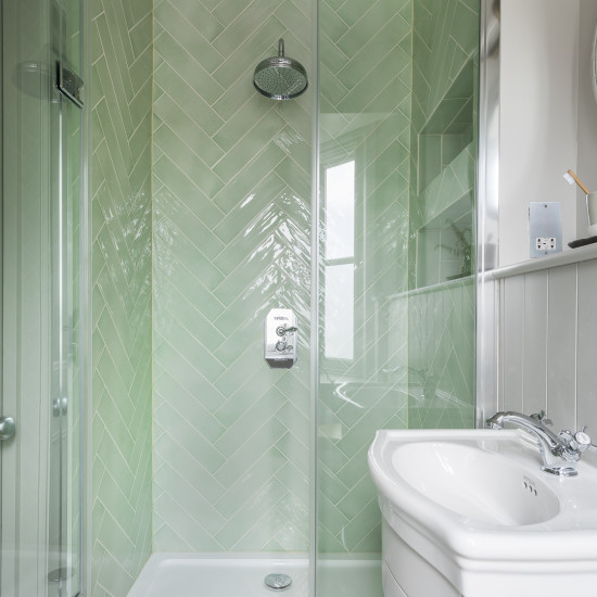
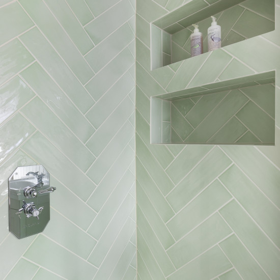
The bathrooms on the first floor were designed to be similar yet slightly different. The Family bathroom was completely re-arranged to incorporate a freestanding roll-top steele bath that we placed at the entrance of the room to ensure that it was the first thing you see for maximum impact. While the ensuite bathroom on the same floor was created to add impact by using a gloss sage tile and then installing it in a herringbone pattern. Tongue & Groove panelling was installed in both bathrooms to align with the contemporary country style of the house.
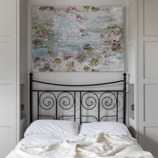
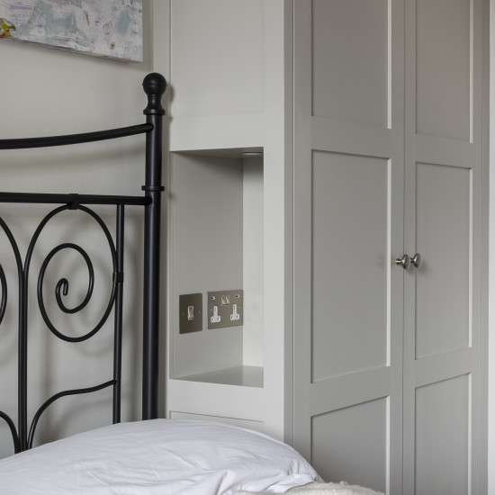
In the spare bedroom on the first floor we designed the cabinetry to allow for guests who were staying over to be able to charge their phones at night by adding little alcoves within the designed cabinetry with USB sockets.
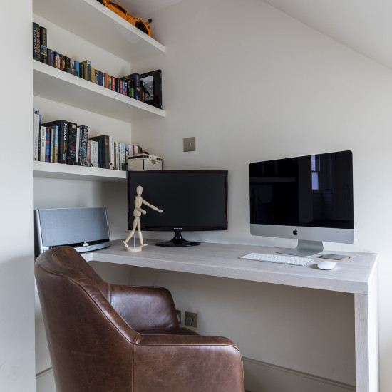
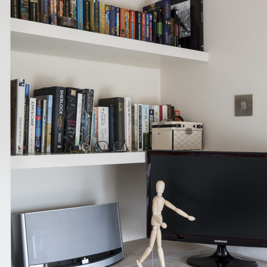
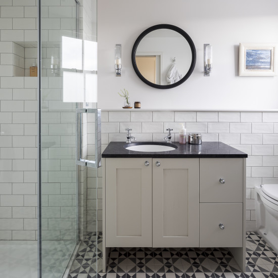
The top or loft floor was reconfigured to allow for a multi-purpose space. Our clients needed to use the space as a bedroom and office and we needed to incorporate an en-suite bathroom. We relocated the existing built in wardrobes and then sectioned off a part of the room to create an office corner while increasing the size of the bathroom to make the space feel more luxurious. The end result was a space that felt larger and more luxurious. The ensuite bathroom on the loft floor was designed with a monochrome feel.
The encaustic tiles in the black and grey pattern was chosen as a modern interpretation of the original Victorian tiles that resided in the house hallway ground floor.
Photography by Chris Snook – http://www.chrissnookphotography.co.uk/
