Modern Rustic House Stamford Brook
Featured in 25 Beautiful Homes
Featured in 25 Beautiful Homes
Featured in 25 Beautiful Homes
MODERN RUSTIC HOUSE STAMFORD BROOK
MODERN RUSTIC HOUSE STAMFORD BROOK
MODERN RUSTIC HOUSE STAMFORD BROOK
MODERN RUSTIC HOUSE STAMFORD BROOK
MODERN RUSTIC HOUSE STAMFORD BROOK
MODERN RUSTIC HOUSE STAMFORD BROOK
MODERN RUSTIC HOUSE STAMFORD BROOK
MODERN RUSTIC HOUSE STAMFORD BROOK
MODERN RUSTIC HOUSE STAMFORD BROOK
MODERN RUSTIC HOUSE STAMFORD BROOK
MODERN RUSTIC HOUSE STAMFORD BROOK
MODERN RUSTIC HOUSE STAMFORD BROOK
MODERN RUSTIC HOUSE STAMFORD BROOK
MODERN RUSTIC HOUSE STAMFORD BROOK
MODERN RUSTIC HOUSE STAMFORD BROOK
MODERN RUSTIC HOUSE STAMFORD BROOK
MODERN RUSTIC HOUSE STAMFORD BROOK
MODERN RUSTIC HOUSE STAMFORD BROOK
MODERN RUSTIC HOUSE STAMFORD BROOK
MODERN RUSTIC HOUSE STAMFORD BROOK
MODERN RUSTIC HOUSE STAMFORD BROOK
MODERN RUSTIC HOUSE STAMFORD BROOK
MODERN RUSTIC HOUSE STAMFORD BROOK
MODERN RUSTIC HOUSE STAMFORD BROOK
MODERN RUSTIC HOUSE STAMFORD BROOK
MODERN RUSTIC HOUSE STAMFORD BROOK
MODERN RUSTIC HOUSE STAMFORD BROOK
MODERN RUSTIC HOUSE STAMFORD BROOK
Modern Rustic House Stamford Brook
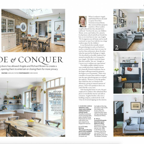
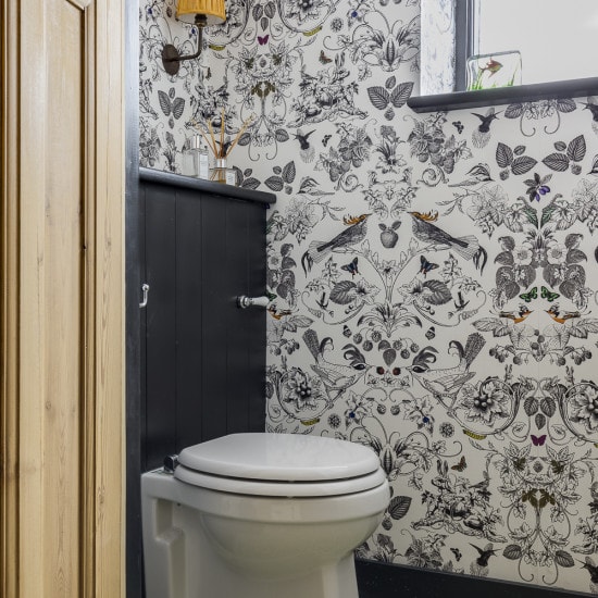
The request for work was to design and implement the interior of a 3 storey semi-detached family home in London. The house undertook a major renovation which comprised of extending the ground floor into a side-return and then extending the first floor to create more space. The house was completely gutted and we started from scratch advising the design of both the layout and scheme which comprised of 4 bedrooms, office, 3 bathrooms, kitchen, dining, reception & TV room.
The brief was to create a warm and homely space that incorporated our clients love of vintage furniture, geometric patterns and colour. With this in mind, we designed the home to a modern rustic aesthetic with a focus on using as many hand-made elements as possible. This meant that each item we introduced into the home was essentially imperfect which helped to create the overall affect of a casual and laid-back home.
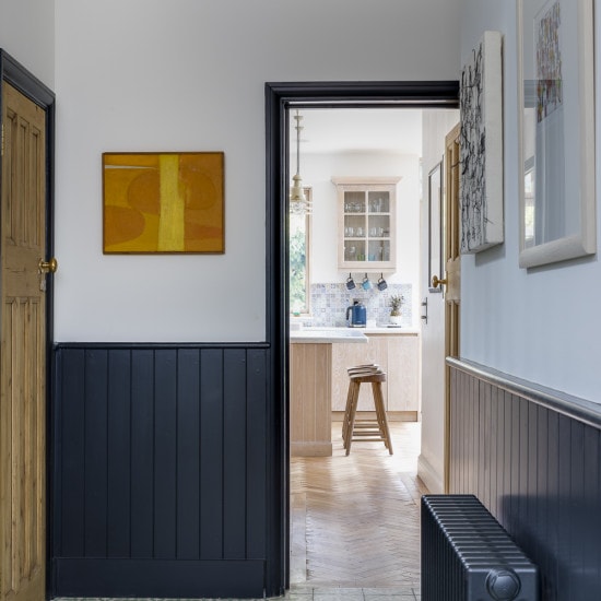
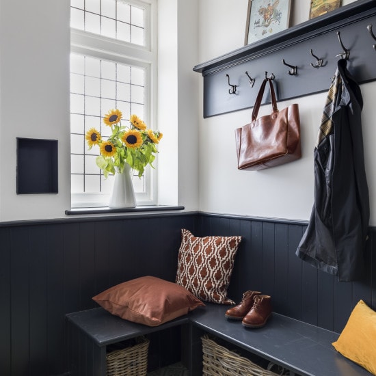
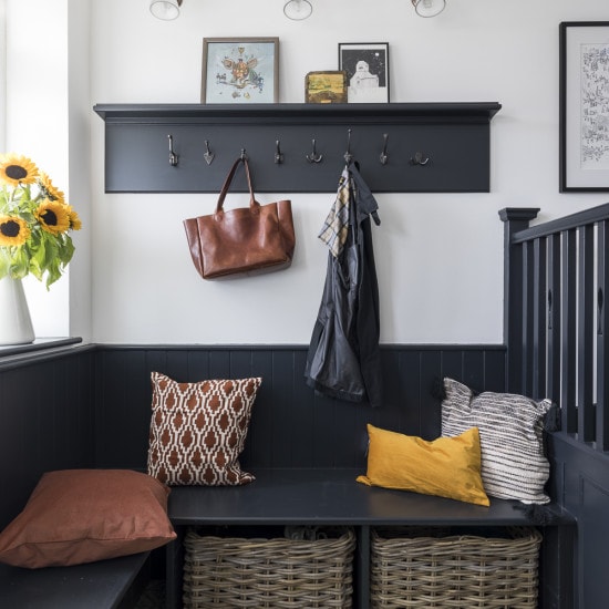
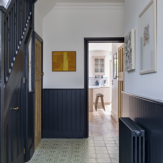
In the entrance/hallway we wanted to create a feeling of drama as you entered the home. So we created tongue and groove panelling which was painted in an off black and installed olive green hand-made encaustic tiling based on an antique tile from the 1800s. A seating area was designed so that you could see the beautiful tiling underneath as you pulled out the baskets used to store shoes and practical items.
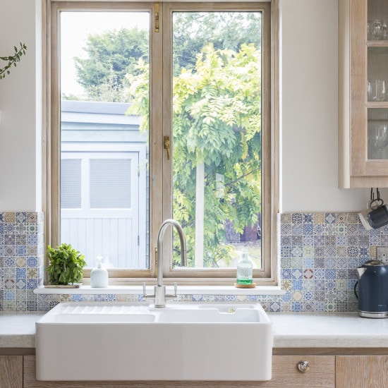
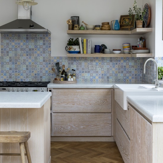
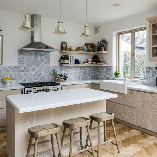
The kitchen was designed to be both practical and yet aesthetically pleasing. The cabinet fronts were made of Oak that was hand scraped to create a textured surface. A white oil was then applied to provide a washed out look. We then incorporated a splash of colour by including the hand-made travertine mosaic tiles which brought the whole kitchen to life. The oak herringbone floor that was laid throughout most of the ground floor was purchased new and then put through a concrete mixer by our talented carpenters to create an “aged” and worn affect.
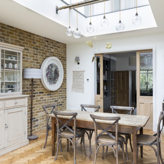
Our clients loved glass, so we used a lot of glass in the lighting throughout the house. Our clients really wanted us to find a place for their Alexander Calder mobile, so we designed the lighting in the dining room to incorporate the mobile. As a result, the 6 hand-blown glass bubbles are wrapped around a pole under the 3 panel skylight and allows the mobile to take centre stage above the dining table.
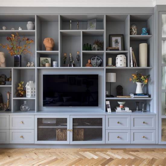
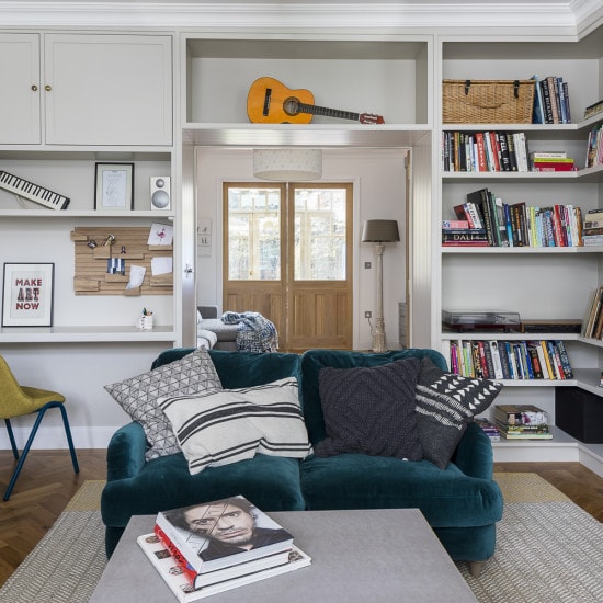
The TV room was designed as a space for lazy Sunday afternoons and movie watching while still providing the ability to display family treasures when not in use. We introduced glass in the sliding doors that reside next to the dining room so that the clients kids could be in another room but still be seen whilst the adults were in the kitchen/dining area.
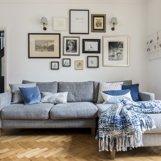
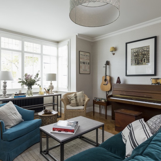
The reception was designed to be a space for the adults to relax in during the evenings. The lighting in this room was designed to create ambience by introducing low pools of light throughout the room while the working fireplace was on. We covered the walls with a linen wallpaper to bring warmth and texture into the room.
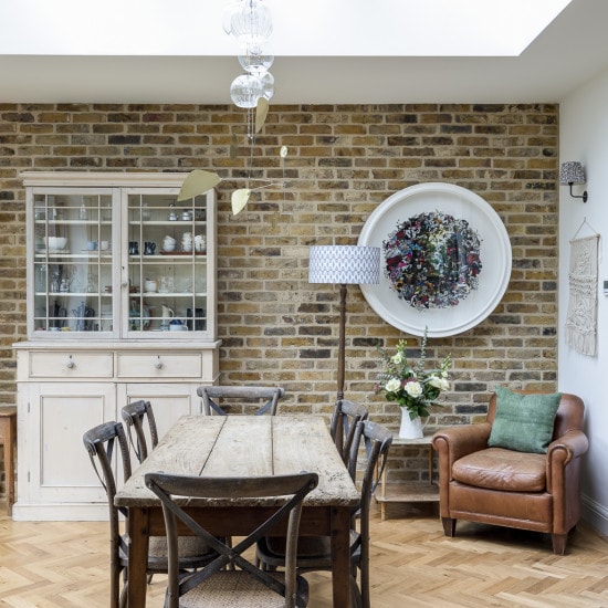
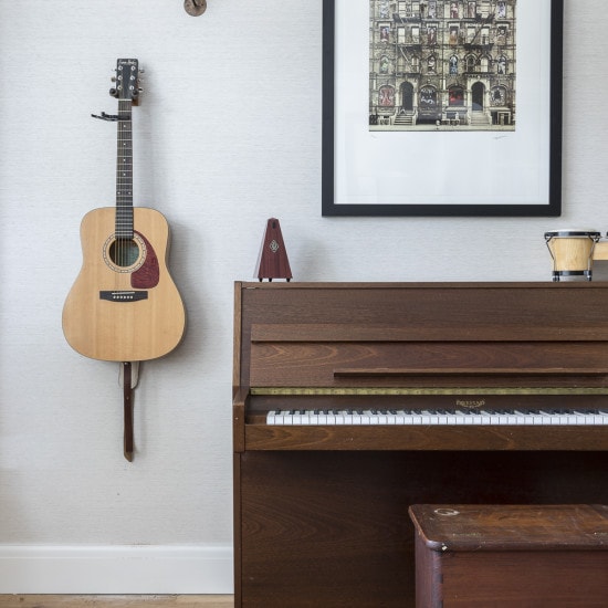
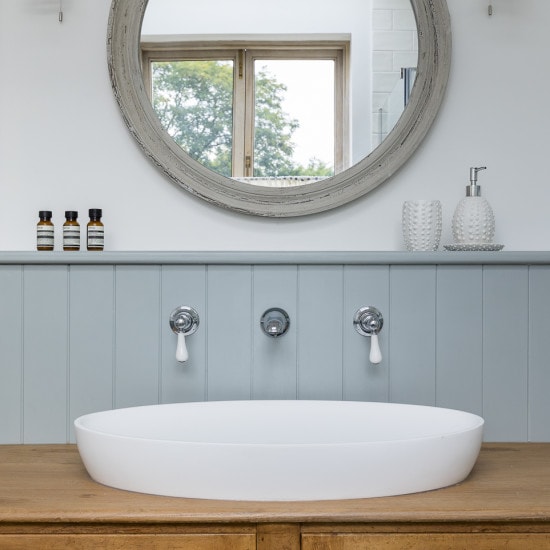
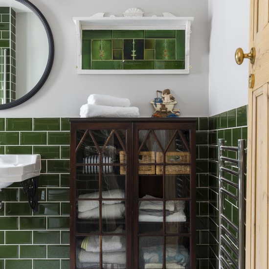
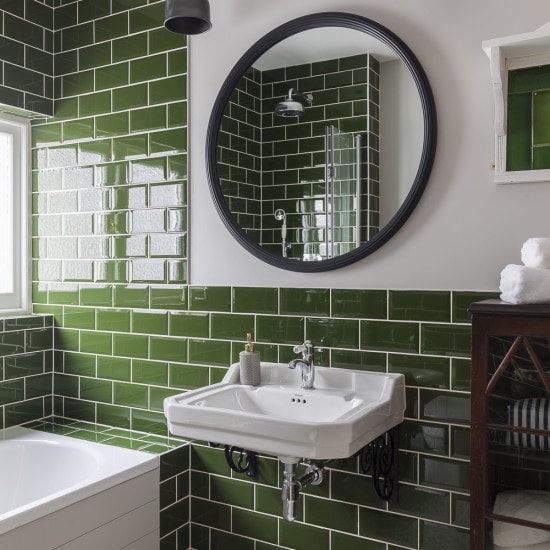
Vintage furniture was used throughout the house and we re-purposed chosen loved furniture which may have otherwise been left in storage. The side board in the ensuite bathroom (a piece that our clients had since childhood) was remade into a sink cabinet, the green tile splash back was turned into a shelf in the family bathroom & the dining room was designed to include the leather armchair because our clients father loved to sit in while he was visiting the family. We ensured that the armchair provided a view of the entire room as well as out the window into the garden.
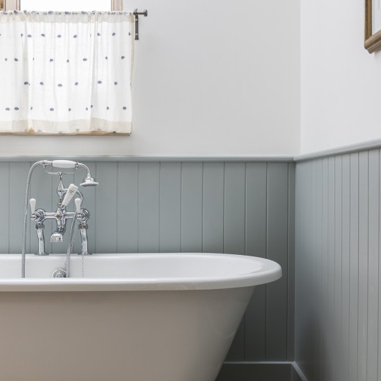
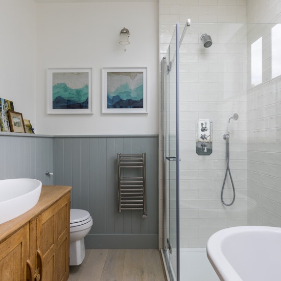
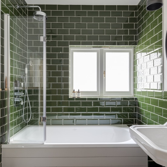
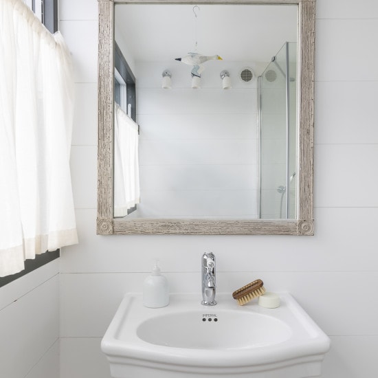
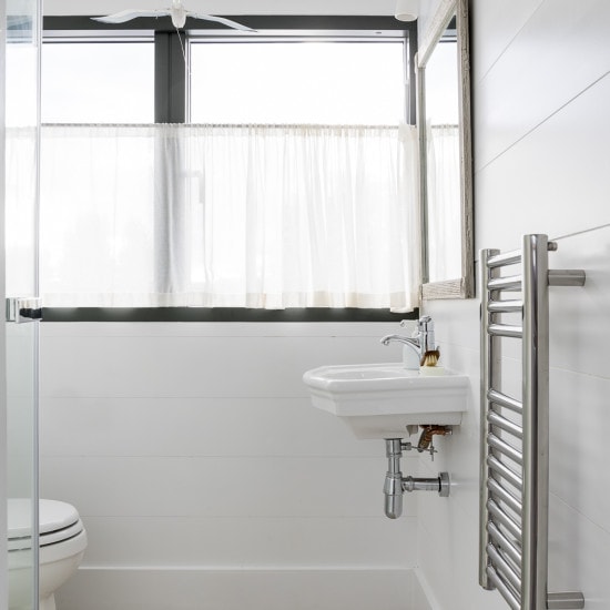
The ensuite and loft bathrooms were designed to be light and serene spaces to chill out and relax in, while the family bathroom was designed to be vibrant and eclectic. We matched a patchwork floor with a bold green metro tile then incorporated a vintage cabinet that is the first thing you see when you enter the room.
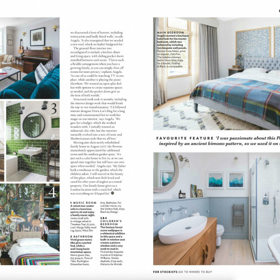
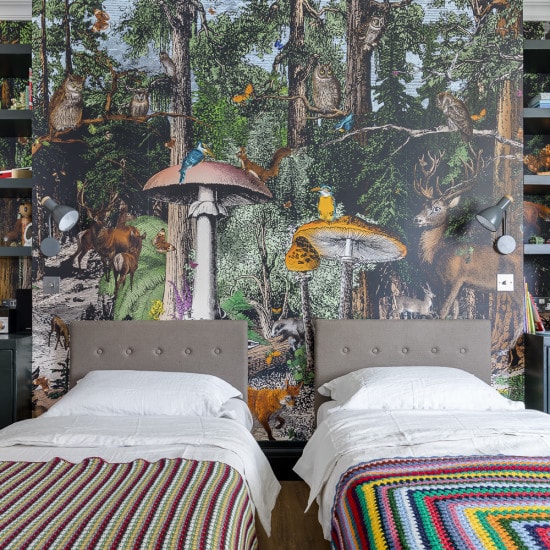
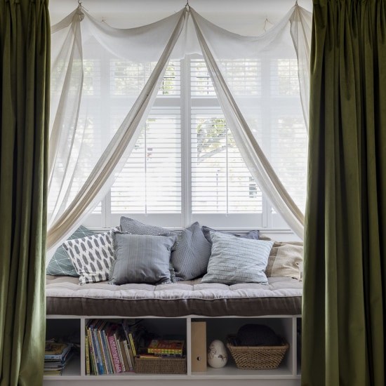
The bedrooms were designed to be warm and cosy places for our clients to retreat into. We used a lot of textures and layers within each room. The children’s bedroom included a snug area within the bay window, a place for them to read and relax in. We wanted to create the feeling of being in a tent out in the middle of a desert or green field, and so we incorporated fairy lights above the sheer structure so they could feel like they were under the stars.
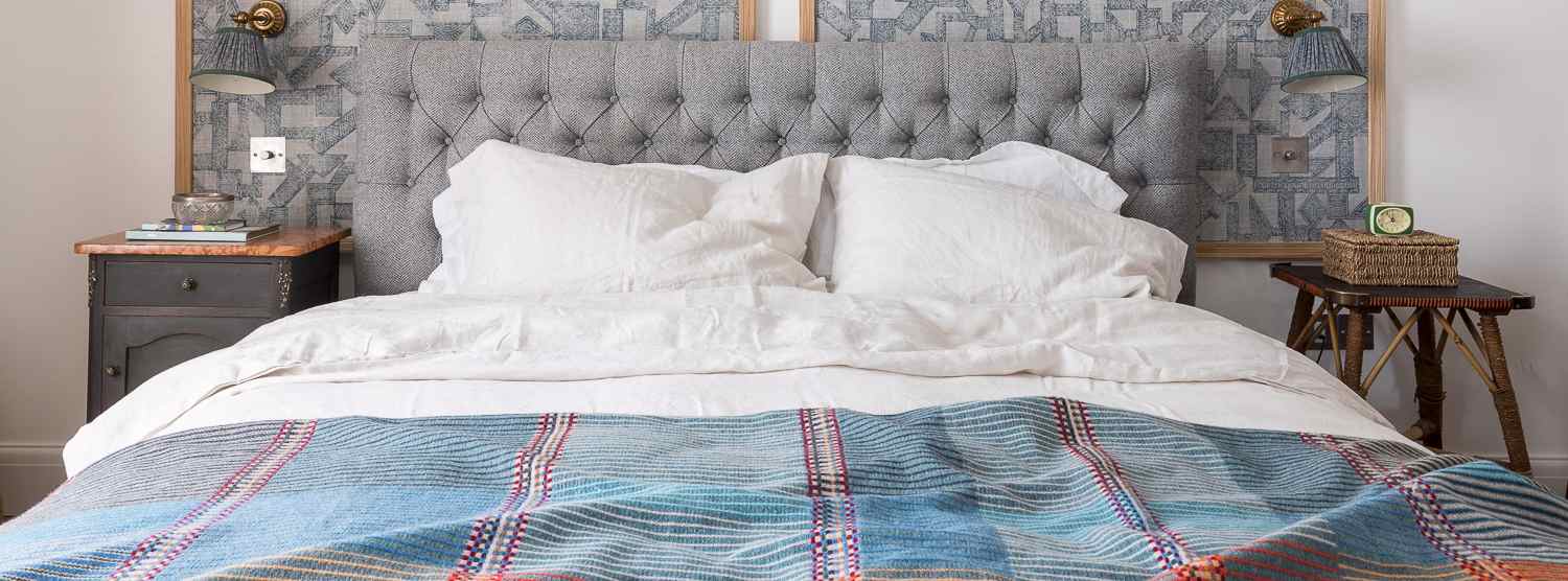
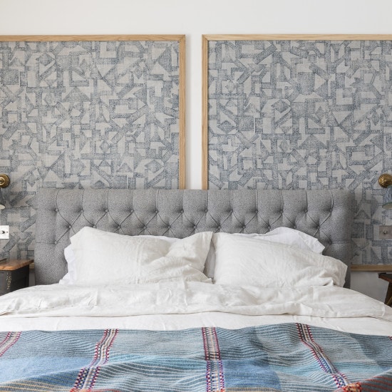
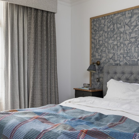
The master bedroom included the design of a double headboard of patterned fabric with an Oak frame and the
curtain was made with 3 layers of fabric.
Photography by Chris Snook – http://www.chrissnookphotography.co.uk/
